
Sorry, Gladiator II (November 22) and Moana 2 (November 27), but I’m going all limited releases this month. Festival season has ended. Award season has begun (congrats to all Gotham nominees). So, while blockbuster sequels still populate most screens around town, they don’t possess the same real estate in cinephiles’ minds. We’re too busy trying to ensure we can say we knew *blank* was getting nominated all along.
Those lucky enough to live in NYC and LA can also take it one step further by hitting those one-week qualifying runs. While I’ll be holding those posters back for early 2025 when they open in more markets (if they even have official posters yet), that doesn’t mean there wasn’t a ton of quality artwork to choose from anyway.
Scrawled


MUBI is always good for a solid if familiar one-sheet and the one they’ve done for Bird (limited, November 8) is no exception. Great use of open space to keep the handwritten title and Nykiya Adams in focus. Text in neat blocks courtesy of the studio’s trademark sans serif. And a quartet of festival laurels every new film would love to wear.
There’s a calmness that’s only interrupted by those four giant letters—their lack of conformity a bold contrast even to the water ripples surrounding Adams’ floating body. It’s enough to grab us without overpowering the large amount of information below. Just like that info is abundant enough to steal us from the imagery without boring us into simply walking away.
Flow (limited, November 22) possesses a very similar structure in reverse due to its disinterest in and lack of a need for too much text. Its thickly scrawled title lies at the bottom to both weigh the sheet down and allow the star (a cat) the room to float above.
Add the circles of fish surrounding it and you get a nice sense of motion. You can feel the cat being pushed by the current (reinforced by the curve of the title) to the point where it will soon be in the background on another loop forward.
Not only is it a dynamic composition, but it’s also very cute with the cat’s Disney eyes and Gints Zilbalodis’ animation style. The physicality of the whole also lends a purposeful quiet that allows us to assume the animal’s adventure will be silent. The story is in the visuals.
As for A24’s Queer (limited, November 27), this roughly drawn font comes with a punk sensibility. This is a counterculture scream teasing title, star, and auteur with splashes and dots of paint. While Ralph Steadman’s illustrations—of which this style is very similar—are generally thought of in conjunction with Hunter S. Thompson, the British artist also worked with William S. Burroughs (whose novella the film is adapted from). So, the aesthetic touchstone is appropriate.
As for the poster itself: I really like the rhythm of light and dark both in the stripes of the mattress (and shorts) and the alternating legs intertwined upon it. They create movement as though the feet are walking despite being locked in place, pushing right to left against the title’s demand we read left to right. Everything fills the gaps in-between. Even a huge centipede adding a smiley face to Luca Guadagnino’s name at the same time as it lends a sense of danger to lovers above.
Bowed heads


There’s something menacing about The Refinery’s poster for Juror #2 (limited, November 1). Because it’s not just Nicholas Hoult bowing his head in contemplation. He’s being watched. Judged. Justice might be blind, but the framing to ensure the sword in her hand remains visible lends a tense bit of drama. The statue becomes a personification of the guilt the tagline projects upon the character.
When you have that level of storytelling in an otherwise simple photograph, you don’t really have to do much else. The title can stay somewhat small and “normal.” And the cast list and credits can be reduced to top-of-the-line names while being pushed to the fringes. The key is to not interrupt the dynamic created between Hoult and Justice.
The head bow on 100 Yards (limited, November 8) is different. Jacky Heung isn’t hiding. He’s waiting. It’s not contemplation. It’s preparation. Once the mob behind him makes its move, he’ll be ready to respond.
The stance provides a powerful energy to the whole. He becomes both the looming figure of potential and the focal point of poised strength. The red smoke is simultaneously a means to create atmosphere and signify the bloodshed coming (while also supplying a solid-ish color field for the credit block). We can anticipate the action that exists on the horizon and the death that will result. Heung is merely waiting for go-ahead to wreak havoc.
As for Angelina Jolie and Maria (limited, November 27; Netflix, December 11)—it’s all poise. Her stance is neither fear nor anticipation. It’s austerity. Beauty and confidence. What a gorgeously minimal portrait in faux duotone to pop the actor’s face through its subtly more yellow hue against the dress and background.
And I absolutely love the high contrast cape stripped off all fabric folds and delineations to transform into a sharp geometric field of black. I’d love less text busying that space up, but the shift from detailed photograph to simple shape is a stunning visual trick that ensures our eyes cannot help but swoop back up to her face. It combines the best parts of the Jackie (face against color) and Spencer (light to dark) posters.
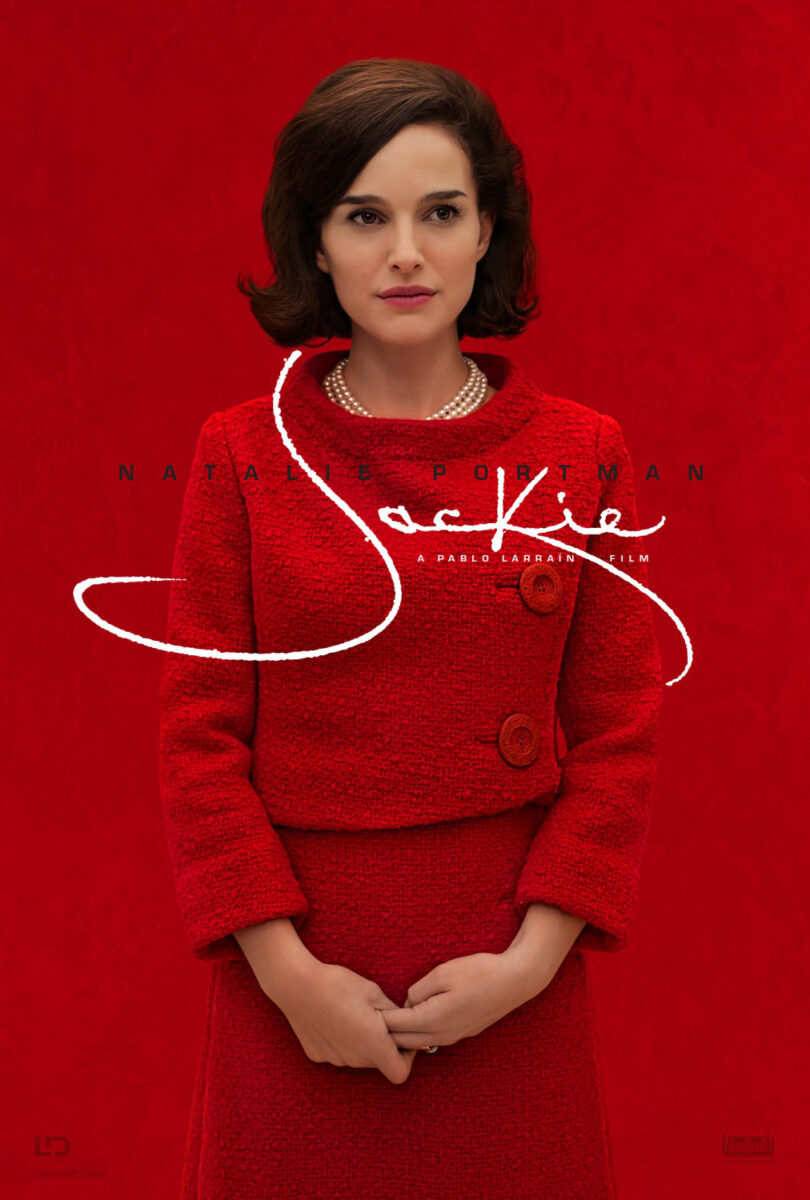
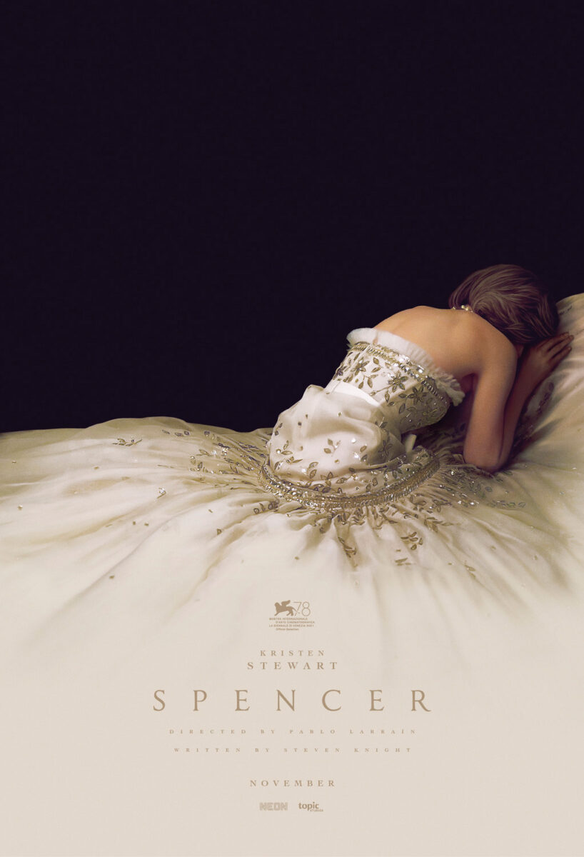
Does it all scream Star Wars? Yes. Swap Jolie for Genevieve O’Reilly and you suddenly have a promo for Andor. That’s not a slight, though. It shows how effective and resonant the work is formally, regardless of who or what is actually being advertised.
Motif


The text might be distracting (Why does Apple’s logo have to be bigger than the title?), but the imagery on the Blitz (limited, November 1; AppleTV+, November 22) poster is stunning. They probably could have just stuck with a photo of Ronan and Heffernan against that pitch-black background and still succeeded, but the addition of those flowers really supplies another level of emotion beyond their embrace.
That it seems to have all been done on a computer rather than painted on canvas is impressive too because the compositing is impeccable. The lighting, coloring, blurring—not one petal looks out of place as they give form to the actors’ bodies while also pulling them apart to leave a second image of Heffernan alone at the bottom.
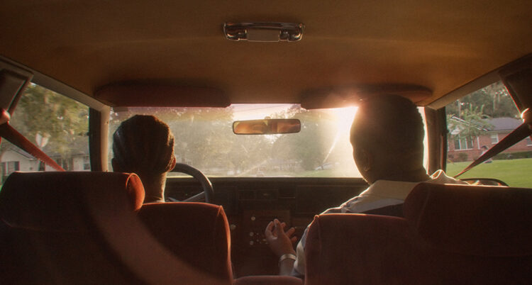
Soundtrack to a Coup d’Etat (limited, November 1) is less about the repetition of a motif and more about the utilization of one. Yes, the capital letters in sans serif of the title are repeating their up and down rhythm, but it’s the combination of them all with the muted coloring and vertical lines that creates a gorgeous throwback aesthetic.
To look at this is to think about an old record cover. It’s retro and fun. It infiltrates your mind with a jaunty, jazzy melody. You therefore assume it’s a music film. That the people in the car are heading to a concert to perform. Until you register what it is the title describes. That the subject isn’t the soundtrack, but the coup d’etat it’s playing above.
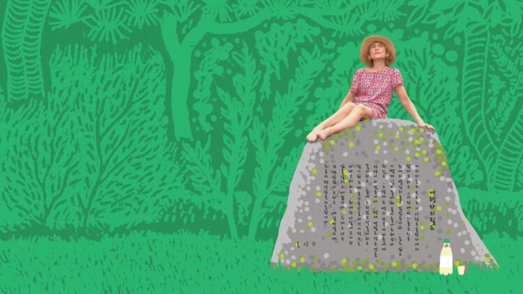
And that brings us to Brian Hung’s A Traveler’s Needs (limited, November 22) combining the formal repetition (woodcut-esque greenery) and cohesive aesthetic (a vibrantly flattened backdrop drawn upon to provide texture without depth) for a singular piece unlike both the glossy Hollywood and grainy indie fare adorning theater walls.
It’s like we’re being transported into a fantasy world of imagination. A glimpse within Isabelle Huppert’s brain to see the magic of perception and the beauty of adventure. Or, perhaps, the effects of makgeolli (I’ve yet to see the film).
The expanse of green is awesome. The intricate detail to build it out with different types of foliage without distracting from the focal point of the actor on a bright pink boulder is impressive. And I love the use of those buildings in the distance to house the credits as yellow-lit windows so as not to invade the forest’s serene space. Because a traveler needs escape. Hung delivers an oasis.
The post Posterized November 2024: A Traveler’s Needs, Queer, Flow, Bird & More first appeared on The Film Stage.


