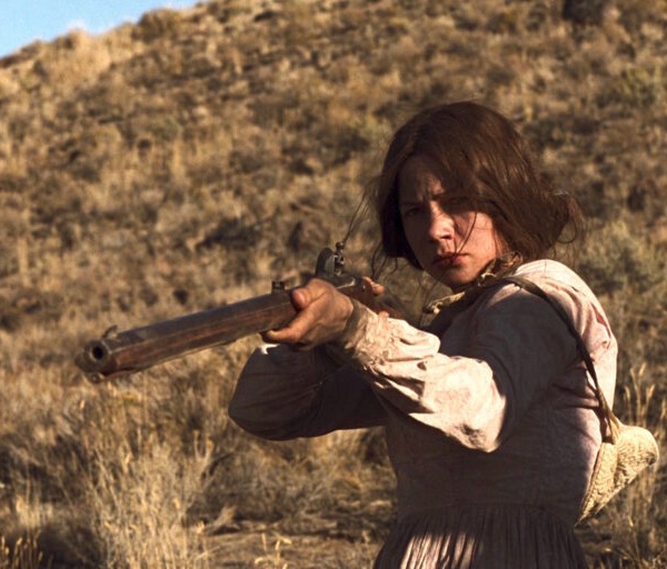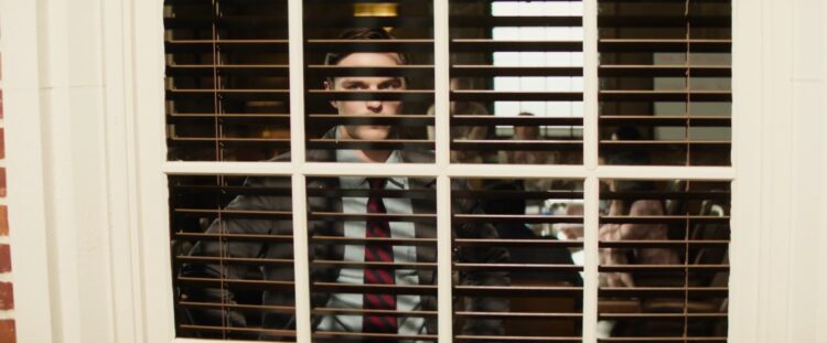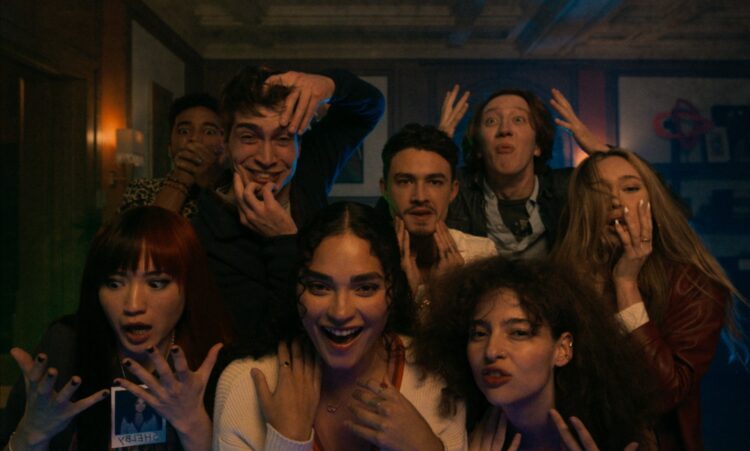

Premiering at Sundance Film Festival earlier this year, It’s What’s Inside seemed to come a bit out of nowhere. Despite its prime positioning in the Midnight section during the first weekend of the fest, the high-concept thriller features no big stars and no huge special effects. It popped off the screen in a big way, delighting festivalgoers and landing a big sale to Netflix only days later. Written and directed by Greg Jardin, this is a deceptively small film that relies heavily on old-fashioned tropes: an engaging mystery, some nifty editing, and a good score.
Ahead of this Friday’s release on Netflix, I spoke with Jardin about his long road to directorial success, the fast-paced aesthetic built from years of making music videos, working with a completed score on set, and pushing for Giallo-inspired lighting alongside grounded character motivations.
This interview has been edited for length and clarity.
The Film Stage: It’s What’s Inside is one of those ideas that when you watch it, you think how deceivingly simple the idea is. Like, how is this the first time this has been done this way? It’s incredible that it took this long to make a movie with this exact hook. Where did the kernel come from?
Greg Jardin: I gave myself a mandate of just trying to write a script that could be made for as little money as possible. Because I’ve been trying to get this other thing going for, like, almost a decade, and I just couldn’t get the financing. So I was like, “Okay, I need to do something like ‘one house one night,’ essentially like a The Big Chill-type set-up.” And I knew I wanted to do something sort of high-concept sci-fi because I’m a sci-fi nerd. So I essentially just [had the idea] that someone should bring a suitcase and something in that suitcase should have something that devolves the evening into a nightmare.
So I was ideating on different things that could be in the suitcase and I had just played the game “Werewolf” at a friend’s birthday party for the first time, and just, like, seeing how insane it got––how high the stakes felt and how people’s emotions were going all over place during that game––it kind of gave me some confidence that something in the suitcase could be, in some way, a game. I came up with the body-swapping idea. I did think that the multiple body-swap thing was something that hadn’t been done, but it wasn’t until I essentially came up with––not to get into spoilers––but the big turn in the movie that got me really, really excited about it and thought that a fresh and unique thing to do with the body-swap subgenre.
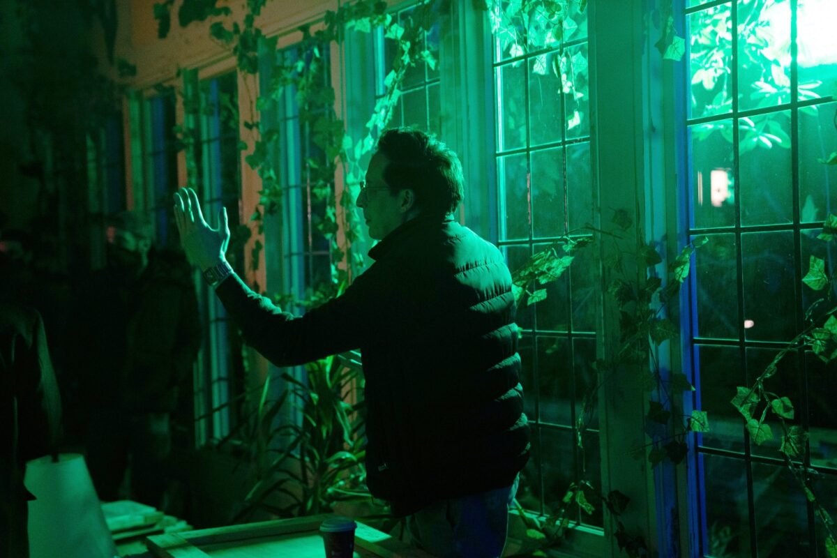
Greg Jardin on set
I love watching a movie where it feels like you’re being written into a corner. Trap is a little like this too. You’re watching it and you’re like, “Where are we going here?” And then a thing happens and a door opens you didn’t even know was there. Watching It’s What’s Inside again, it struck me how––this is obviously a low-budget film, as you said––you don’t need any money to do that necessarily. It’s its own special effect, which I think is so cool.
I wanted to talk about the social-media element for a minute, because there’s such a manic aesthetic that you build, right? And that’s editing and that’s other stuff and we could talk about that. When Shelby (Brittany O’Grady) is in the car with Cyrus (James Morosini) and there’s that symphony score and she’s scrolling through everything… it’s so essential to the movie because the movie itself is like a doom scroll, kind of.
That was in the script but in the script it was a much shorter version. It was essentially just Shelby just scrolling through Nikki’s [Instagram]. We had the “Oh Hey Cutie” reveal and then [Shelby] posts. It was one of those things where we were in the edit and I had a totally separate music cue that our composer had written for that section. In the edit, when I just started to play with it and I just started to get ideas, I was like, “Oh, wait, this could be something bigger.” I went to the Walt Disney Concert Hall, I watched the LA Philharmonic, I smoked a joint, and hearing the bombastic classical music I was like, “Oh my God”––and the edit is fresh in my mind––and I was just inspired to make that the soundtrack to the Instagram thing, as if this is what’s going on in Shelby’s mind. So then once I laid that track down, I kind of just beefed it up, and then we had to kind of go and get more social-media stuff for Nikki (Alycia Debnam-Carey). But that ended up being a really nice and quick way to really tell us a lot about Nikki. And not just Nikki, but Shelby as well.
With filmmaking nowadays, there’s so much to contend with. So many devices. You have so many films now that set the movie at a certain time to avoid the devices, and I totally get doing that. So it’s so refreshing that you don’t avoid them. They are so essential to our life, for good and plenty ill, that it informs the rest of the movie––so much of the motivation has come from these semi-fictions on the phones, even to the point of connecting the more traditional gossip narrative with Forbes’ sister and asking, “What is the truth here?” That’s its own kind of beautiful Russian doll. I’m going to get overly technical, but I couldn’t get over the coloring and the editing. Because I know you did a lot of this yourself. You were very involved with every aspect of the film. Where does that beautiful neon color come from? How do you get to that color?
So essentially, when I was like, “Okay, I’m going to write a movie that takes place in one house”––you know, people in a house over the course of one night is essentially like a subgenre, right? There’s a thousand movies like that. A lot of them are great. The Big Chill, in my mind, is the grandfather of them. But I was like, “How can we make this house just feel different than every other house that we’ve seen?” So it started, sort of, from that question. And then that led to the house should be owned by a woman who is an artist. The backstory we gave her was that she was basically just a wealthy artist who took a lot of drugs and then just converted her house into art installations, which is why it looks like that.
And then sort of going beyond that: I love the idea of emotionally motivated lighting, having lighting cues help the narrative devices in the film. We also leaned a lot on Giallo films, specifically Argento’s Suspiria. I remember seeing Suspiria for the first time; I was much younger. At the beginning, Jessica Harper is getting into a cab from the airport and the airport is lit with, like, red light and it’s so unrealistic but it creates such a mood. And I was like, “Man, I didn’t even realize, like, you could do that in movies.” And so that really planted the idea in my mind of, like, you can use more expressionistic lighting. So let’s make this house sort of look like a world in and of itself while we try to keep the emotions and the characters’ feelings as grounded as possible, but we can sort of make the world that they’re in more magical.
Yeah and when you’re building the color design in post-production, using different LUTs and whatnot, I assume you’re just extending the style… let’s make this more red or more purple or whatever, right?
Yeah, I mean, we had like a basic LUT on set. Obviously we changed it a decent amount once we got into color, but a lot of it was really just, like, very saturated lights. Working red, green, and blue elements into the production design was a big thing. And just trying to get as much of that stuff there on the day as possible was really what we tried to do. And then, you know, the fun in color where you’re, like, enhancing stuff and bringing stuff out. But yeah: it was certainly a very saturated, colorful set.
I do want to shout out Brittany O’Grady. Even though it is an ensemble piece, you need to be rooting for the Shelby character the whole time. And without going crazy with spoilers: people are playing at different emotions and motivations, things are changing, etc. But there is an anchor and it is Shelby. One moment I love in the beginning––and I’m wondering how you got to this moment in the script or on set––is the bird thing when they’re walking into the house. It’s such a good rendering of a relationship. Obviously their relationship is having trouble, but it’s such a relatable moment for any relationship, I think. She overreacts, he underreacts, and that energy then goes into the house. How do you get to that moment? It feels like a perfect calibration… every person has had that conversation.
Shelby is a very anxious character. I’m a pretty anxious guy. Like, the idea of going to a party where you’re seeing people and everyone’s talking over one another––that kind of situation kind of makes me nuts. I was like, “Okay, the film itself should make the audience feel the way that Shelby feels.” It’s essentially like the first ten minutes: Shelby kind of keeps getting dunked on and so I wanted there to be this bird that was essentially like a manifestation of her anxiety. “I really don’t want to go to this party; I really don’t want to go to this house. My partner is just chatting as if he’s, like, completely unaware of my anxiety.”
We needed something to comically exacerbate her anxiety. I went through a bunch of different ideas, but we kind of landed on this idea of this bird that Cyrus doesn’t even see. He thinks she’s probably making it up, which is a sort of metaphor for anxiety. And then I sort of love the double whammy of her telling the others about it and then they seem overly concerned.
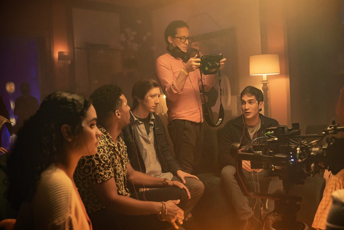
Greg Jardin and cast on set
I love that too! The button of it––which is almost buried in the sound mix, almost beneath another layer of sound––but there’s so much fallacy in that reaction. It’s a great beginning, middle, and end as its own little joke. To that point of the storytelling: the movie gets faster as it goes on. You must have come to that late, right? The last 20 minutes fly. When you figured out to pace it like that in the film, that must have felt like a huge win. That’s such a crucial part of the movie that it’s a crescendo.
That was something that was really massaged in the script. It was not quite as fast initially and then specifically one of my producers, Bill––William Rosenfeld––he was like, “Essentially once this one thing happens, in the script, it should just be a barnburner from there on out because there’s a ticking clock; there’s all this pressure on the characters. So we should just not really take a lot of breaks in the pacing.” He really pushed me to kind of tighten that up in the script. And then certainly going into the shoot, I’d had that music already, ready to go. Andrew Hewitt, our composer, did all the music in advance. I’m playing that cue as we’re shooting it.
Really? Oh, wow. That’s awesome. That helps.
Yeah. Very, very helpful. Not just for me, but for the cast to hear it. Sometimes as we’re shooting, I have an earbud in my ear and I’m listening to it…having the music there to help dictate tone and pace was massive.
For those reading who maybe don’t know this: having your score recorded and available on set while shooting is not traditionally what you would do. To your point, it obviously helped because I do think it’s one of those things where it’s never slow, but certainly––given it’s a one-location movie––there is an element of those first 20 minutes, you’re looking around, you’re finding the characters, there’s quite a bit of discovery. And then those last 20, it moves fast and it’s kind of incredible because you don’t have time to get to question stuff, to get all snooty about it. You just kind of enjoy the ride, which I think is so important.
I had the whole thing build towards, not like a Mexican standoff exactly, but like our version of a Mexican standoff where it culminates in what we would call the shitshow scene. Where it’s essentially like it ends with everybody yelling. I knew the climax point should just be, like, it devolves into total chaos and you’re sort of unclear as to what’s happening, but ideally in a good way. Like in an Agatha Christie unclear way.
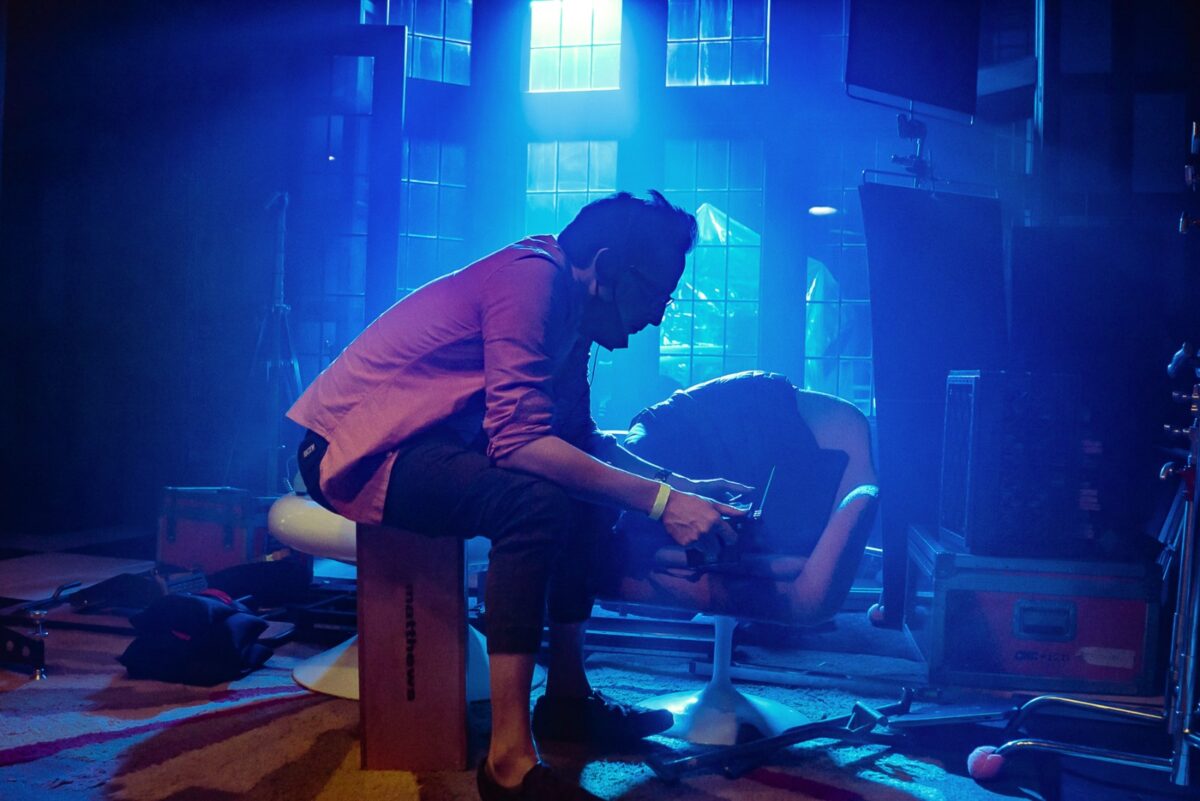
Greg Jardin on set
Do you have a favorite editor or editing style? We have a podcast called The B-Side and we talked with Darrin Navarro, a great editor who just worked on His Three Daughters, about Sam O’Steen, another great editor who worked on a bunch of classics. O’Steen was great at allowing the characters in each film to lead to where the next splice was going to be. There’s a scene in the third act of It’s What’s Inside that hinges on a character making a decision and changing quite drastically. It’s a very motivated editing choice that then informs the rest of the movie. And I wonder if there is anything, even if it’s a movie, that you draw inspiration from editorially?
A lot of it comes from a musical background. I played drums––not well––but I played drums, guitar and piano. I learned all these instruments in high school and I still play them. I used to write music and stuff. So a lot of it is from just the idea of trying to cut as musically as possible and having cuts happen on downbeats or where something in the music accents the cut. The entire movie is more or less cut like that. So it kind of ends up giving it this sense of propulsion. It’s almost like the film itself is just a visual-vestigial arm of the score. And part of that has been beaten into me by directing and editing music videos and promos where stuff has to be very tight and very rhythmic. I mean, I would just lay down the score and always cut straight to that. I didn’t cut to any temp score. And Andrew, our composer, gave me all the stems. So there were certain times when I would move little bits of instrumentation or percussive hits in the stems to really accent what you see onscreen. And it really has this––even if you’re not really, like, a musical person––I feel like it has this kind of subconscious, larger effect.
I love how you hold on the title slates longer than you normally would. It gives us a breath. As we wrap up here: what’s a standout for you, aside from just many people being able to finally see the movie, from the last nine months, as somebody who’s worked in all of these different capacities for so long?
Really the whole time in LA, I’ve worked in marketing in some capacity or another. The past eight years prior to directing It’s What’s Inside, I was mainly doing marketing shoots for Netflix, for Netflix shows, and I was doing a lot of these pitches to the Netflix marketing team, but also to the showrunners. And if you get into one of these marketing presentations, you know, all the creators are around the table and then you pitch these ideas to the sort of people in charge. And, you know, a few months ago we had a marketing presentation at Netflix where people were pitching to me, and it was very emotional and surreal. I was just so grateful. I was like, “This is so wild.” I’ve been in everyone else’s shoes really not very long ago at all. So the fact that they’re now pitching to me with this sort of same excitement and thought that I put into other people’s pitches––it just felt really special. It’s so tripped-out, though!
It’s What’s Inside arrives on Netflix on Friday, October 4.
The post It’s What’s Inside Director Greg Jardin on Manifesting Anxiety, Giallo Lighting, and the Road to Success first appeared on The Film Stage.


